"Who am I?" - "What is my goal, what is my motivation?" - Big questions that a "CD" (corporate design) should convey. The image of a company is transported to the public through colour and form, blah, blah, blah. Since the Big Five and the alt-right, we know that appearance can also mean the opposite of what inner motivations actually are. Why am I telling you this? Because the question of the appearance of ROTxBLAU has been raised in the last few weeks and I therefore had to reflect on my own motivation. According to the motto: New year, new CD! Even if we are a bit overwhelmed with a self-image, we try our best to summarize our work. In this article, I'll explain to you exactly what ROTxBLAU does and how I came up with our new CD.

The motivation
In the run-up I had a number of thoughts about how our company, but also our enterprise, could be presented to the outside world. In 2017 we had the motto "We want to combine risky projects of passion with financially strong orders." And we tried to convey that with a slick black and white look. Not so elegant, and we didn't know at the time that this daydreaming would end up being a completely normal game studio. But hey. We were still as neat as a pin. Much more important is what motivates us today. Dear "Indie Advisor" André Bernhardt brought us in a new direction in a meeting with direct questions about our studio character: "Future-Positivity" and "Discursive Games". Be optimistic and socially relevant. OK. We liked that for now ( albeit somewhat reluctantly, as we couldn't get comfortable with any of the alternatives available).

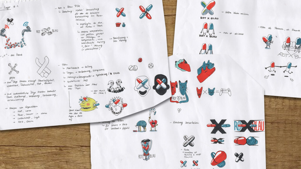
From now on, the two colors red and blue should not only cross each other, but become one. Together they should step into an optimistic future and still carry a certain duality within them. To make this possible, after a rather wild brainstorm of different sketches, I ended up humanizing the two pills (see picture below). Especially the first picture of the two figures showed them hand in hand with their “back” to the camera. I also shared this draft with the others and lo and behold: everyone was enthusiastic and felt directly drawn to the two sweet-hearted pill people. I prefer to call them “Pillpill” – Pill times two becomes People, simply Pillpill. It sounds stupid and it is, but it's also funny because your tongue almost gets knotted when you say it. Nevertheless, it is just as beautiful, touching, friendly, warm and approachable to see the two Pillpill together.
Okay, so let's take the two figures. New "company signet", check! So we no longer have a rigid logo and instead a playful, constantly changing one. In a way we now have mascots instead of logos.
The name
We didn't make it easy for ourselves with the name we gave ourselves about five years ago. Why the hell is there an "X" in the middle of two German color names? Yes, because it's supposed to mean "red crosses blue," but until you hear it spoken, the name gives you every idea in the world except ROT "icks" BLAU. Then one rather reads "ROT times BLAU" (Red times BLUE; doesn't work that good in English), "ROTand BLAU" or only "ROT BLAU". Unfortunately, a logo with two crossed pills – one red, one blue – could not change the misunderstanding. Nobody checked and we stayed the dudes from red and blue.

The company lettering
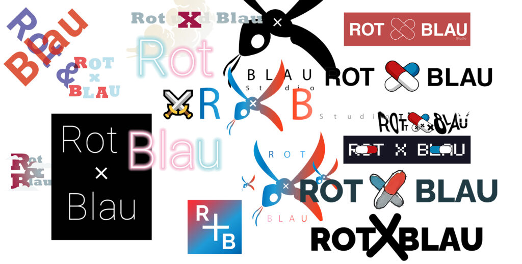
When it came to “company lettering”, I didn’t really get the hang of it at first. Different ideas with new crossed pills in the middle of the writing didn't want to fit properly. In the end I tried it again with a letter. I wrote a small "x" using the naïve "Schoolbell" font and scaled the letter so large that it was impossible to miss. Then I suddenly noticed that the x was always written in lower case and thus disappeared a little into obscurity. Due to the pill cross, it was no longer really recognizable as a letter.
Now the X is the largest element in the lettering and finally makes it clear that our name is a kind of fusion that is at the forefront here. It is not the two colors that are in the foreground, but the combination of the two and the handwritten character conveys a playful nature at the same time! Eureka!
The colors
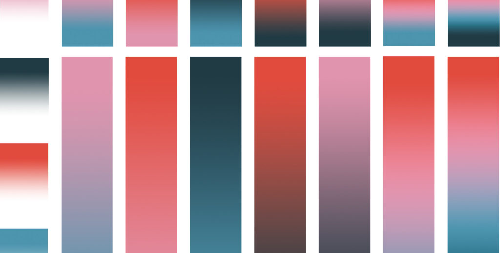
Then a few more colors were added! The new ones are less luminous, but somewhat duller and more unsaturated. Not so euphoric, rather a little more unobtrusive and modest. After finding the new red and blue, I blended the two tones together and ended up with the pink, which is now featured as a very dominant color on the website.

Again, as with the lettering, the fusion of the two sides is brought to the foreground. I wish I could say the two pills are ALL colors, but then the mix would just be brown like a SA uniform. So let's stay with pink - it also stands for states such as vulnerability, softness and loveliness. I like to open up this counter-trend in the gaming scene. Away from the efficient super-glossy real-like shooter and towards the sensitive, consciously self-designed indie title. That brings us back to future positivity.
In short: The new CD is more like us. That feels very good and makes it easier for us to communicate outside of our own little cosmos.

